Full Colour Logo
Two Variations
The Optiom logo is crafted to inspire trust and instill a sense of optimism in everyone who engages with our brand. Conveys professionalism in a welcoming, approachable way.
Full Colour Logo
Main Logo
This is the main logo which is shown in a vertical stacked design. This is to be used when space allows.
Full Colour Logo
Secondary Logo
This is the secondary logo which is to be use in a horizontal format when added to a website banner header or other narrow designs.
Monochrome Logo
Main Logo In White
The white logo can be used on solid colours, such as the brand colours, as it appears more clearly.
Monochrome Logo
Main Logo In Black
On textured or image backgrounds, the black logo can be used for all the marks to appear clearly.
Main Logo Elements
Logo Mark - Optiom Swoosh
The logo mark features a semi-complete circle with an opening at the top and an extended loop heading out to the top right.
Main Logo Elements
Word Mark - Optiom Name
The wordmark displays the brand name in 6 letters in a vertical format in the XM Rounded font.
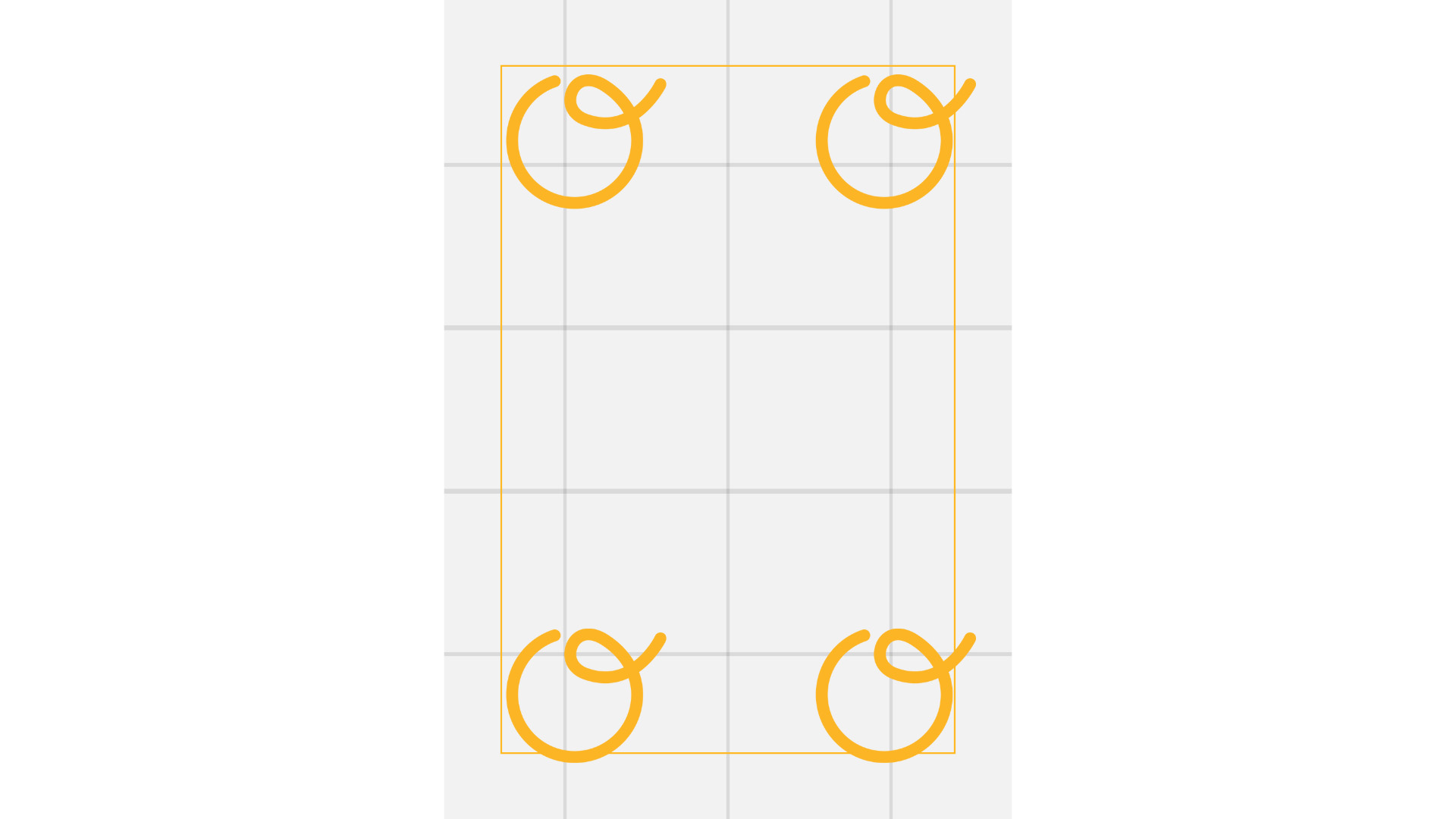
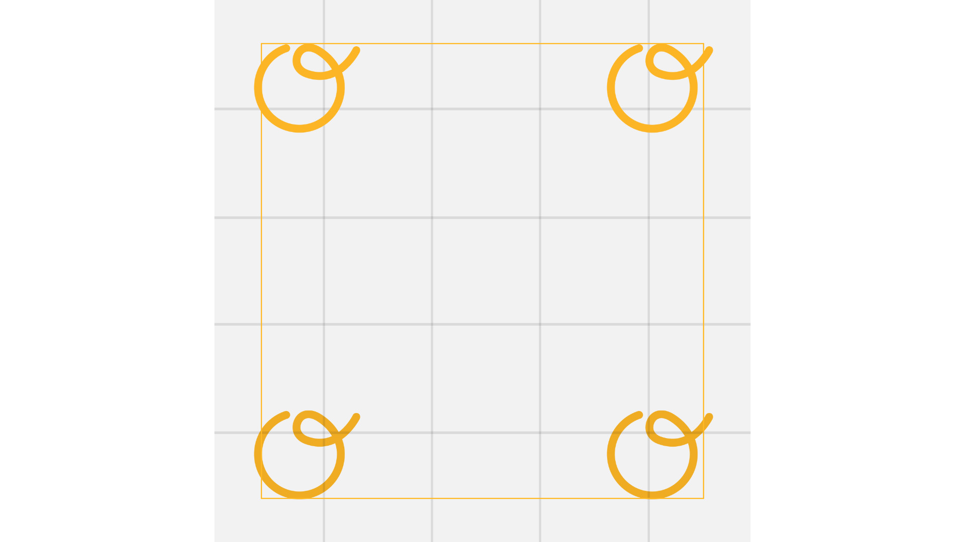
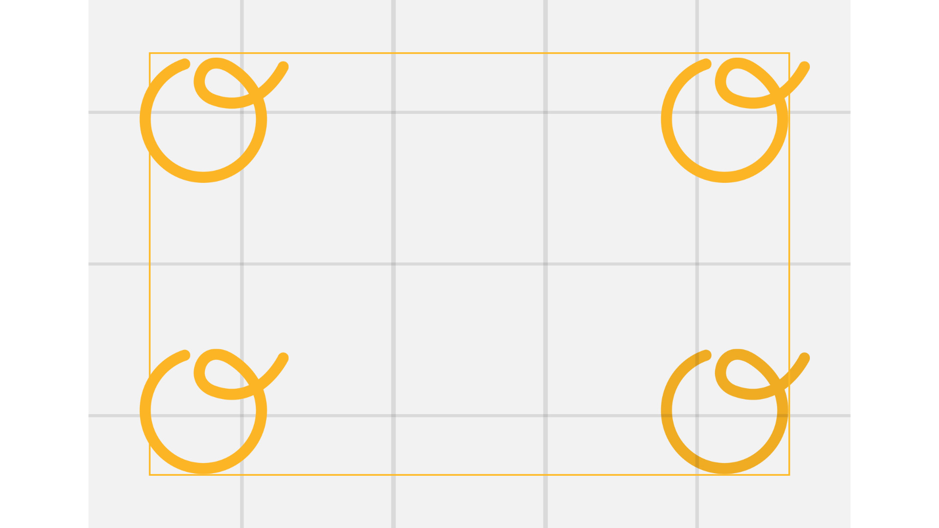
Main Logo Elements
Clearspace - Optiom Wordmark
The wordmark requires space around it to stand out and is not meant to be crowded. The clear space around the Wordmark is the width of the letter O on either side all around it.
Rules Of Application
Don't Do This
The logo is not meant to be distorted by shape or colour alterations.
DO NOT change the colour. Use colours in the palette.
Rules Of Application
Don't Do This
The logo is not meant to be distorted by shape or colour alterations.
DO NOT crop the logo.
Rules Of Application
Don't Do This
The logo is not meant to be distorted by shape or colour alterations.
DO NOT rotate the logo.
Rules Of Application
Don't Do This
The logo is not meant to be distorted by shape or colour alterations.
DO NOT place the logo mark below the word mark.
Rules Of Application
Don't Do This
The logo is not meant to be distorted by shape or colour alterations.
DO NOT replace any letter O in the word mark with the logo mark.
Rules Of Application
Don't Do This
The logo is not meant to be distorted by shape or colour alterations.
DO NOT place the logo mark after the word mark.
Usage Examples
Proper Logo Placement
Physical Assets
Usage Examples
Proper Logo Placement
Digital Assets
Usage Examples
Proper Logo Placement
Promotional Assets